Mastering Responsive Design
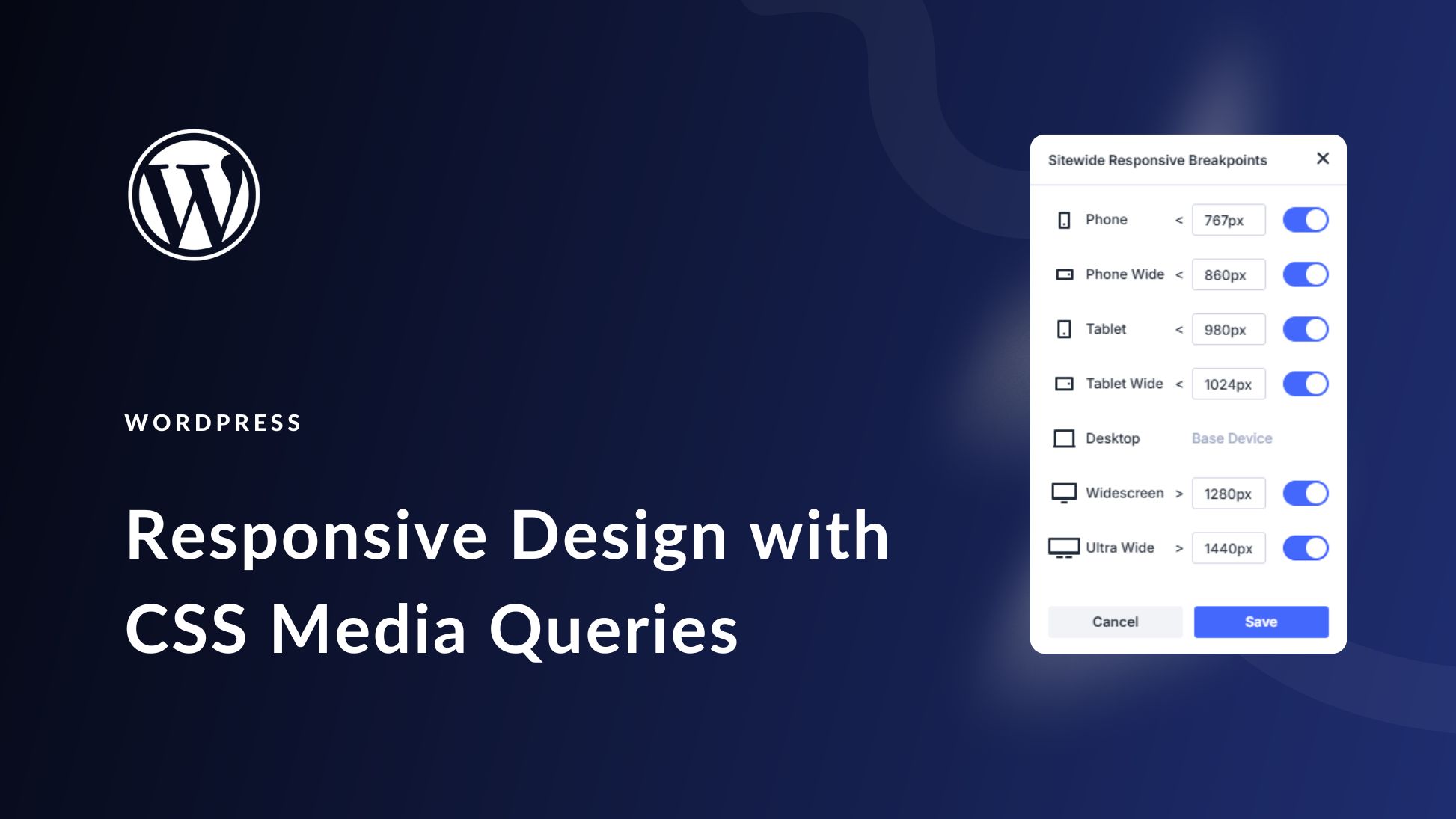
In today’s multi-device world, mastering responsive design is essential for reaching and engaging your audience. This blog explains how to build websites that adapt fluidly across a range of screen sizes and device types. We cover the fundamentals of fluid grids, which allow page layouts to resize proportionally rather than using fixed pixel widths. Flexible images and media ensure visuals scale appropriately without breaking the design. CSS media queries enable targeted styling for different device widths, orientations, and resolutions. A mobile-first approach is emphasized, where design begins with small screens and progressively enhances for larger displays. We also discuss making touch-friendly interactions, adapting navigation menus for mobile devices, and tools for testing responsiveness across platforms. Responsive design improves user experience, accessibility, and SEO rankings by ensuring your website performs optimally regardless of how visitors access it.